Time Series in Python
General good links for time series:
book: http://www.maths.qmul.ac.uk/~bb/TimeSeries/
simple intro: https://towardsdatascience.com/the-complete-guide-to-time-series-analysis-and-forecasting-70d476bfe775
Basic TS concepts
See https://medium.com/@ATavgen/time-series-modelling-a9bf4f467687
Stationarity:

It is stationary when the trend line is 0 and the dispersion is constant in time. For example, white noise is a stationary process.
The test for the stationarity of a time series is the Augmented Dickey-Fuller test (see below)
Seasonality:
It is possible to decompose a signal into different pieces: the trend, the seasonality, the noise:

Autocorrelation (ACF):
the autocorrelation function tells you the correlation between points separated by various time lags. As an example, here are some possible acf function values for a series with discrete time periods:
The notation is ACF(n=number of time periods between points)=correlation between points separated by n time periods. Ill give examples for the first few values of n.
ACF(0)=1 (all data are perfectly correlated with themselves), ACF(1)=.9 (the correlation between a point and the next point is 0.9), ACF(2)=.4 (the correlation between a point and a point two time steps ahead is 0.4)…etc.
So, the ACF tells you how correlated points are with each other, based on how many time steps they are separated by. It is how correlated past data points are to future data points, for different values of the time separation. Typically, you’d expect the autocorrelation function to fall towards 0 as points become more separated (i.e. n becomes large in the above notation) because its generally harder to forecast further into the future from a given set of data. This is not a rule, but is typical.
Note on the PARTIAL autocorrelation (PACF): The ACF and its sister function, the partial autocorrelation function (more on this in a bit), are used in the Box-Jenkins/ARIMA modeling approach to determine how past and future data points are related in a time series. The partial autocorrelation function (PACF) can be thought of as the correlation between two points that are separated by some number of periods n, BUT with the effect of the intervening correlations removed. This is important because lets say that in reality, each data point is only directly correlated with the NEXT data point, and none other. However, it will APPEAR as if the current point is correlated with points further into the future, but only due to a “chain reaction” type effect, i.e., T1 is directly correlated with T2 which is directly correlated with T3, so it LOOKs like T1 is directly correlated with T3. The PACF will remove the intervening correlation with T2 so you can better discern patterns. A nice intro to this is here: http://people.duke.edu/~rnau/411arim3.htm.
So PACF corrects the lag-1 problem of the ACF. See also here for python use: https://machinelearningmastery.com/gentle-introduction-autocorrelation-partial-autocorrelation/
Partial autocorrelations measure the linear dependence of one variable after removing the effect of other variable(s) that affect to both variables. For example, the partial autocorrelation of order measures the effect (linear dependence) of yt−2 on yt after removing the effect of yt−1 on both yt and yt−2: see https://stats.stackexchange.com/questions/129052/acf-and-pacf-formula

A beautiful video constructing ACP and PACF: https://www.youtube.com/watch?v=ZjaBn93YPWo
Forecast quality metrics
Before actually forecasting, let’s understand how to measure the quality of predictions and have a look at the most common and widely used metrics
Metric |
Description |
Range |
Tool |
|---|---|---|---|
R-squared |
coefficient of determination (in econometrics it can be interpreted as a percentage of variance explained by the model) |
(-inf, 1] |
sklearn.metrics.r2_score |
Mean Absolute Error (MAE) |
it is an interpretable metric because it has the same unit of measurement as the initial series |
[0, +inf) |
sklearn.metrics.mean_absolute_error |
Median Absolute Error |
again an interpretable metric, particularly interesting because it is robust to outliers |
[0, +inf) |
sklearn.metrics.median_absolute_error |
Mean Squared Error (MSE) |
most commonly used, gives higher penalty to big mistakes and vice versa |
[0, +inf) |
sklearn.metrics.mean_squared_error |
Mean Squared Logarithmic Error |
practically the same as MSE but we initially take logarithm of the series. As a result we give attention to small mistakes. As well usually is used when data has exponential trends |
[0, +inf) |
sklearn.metrics.mean_squared_log_error |
Mean Absolute Percentage Error (MAPE) |
same as MAE but percentage. Very convenient when you want to explain the quality of the model to your management |
[0, +inf) |
not implemented in sklearn |
Here is how to get all of them:
from sklearn.metrics import r2_score, median_absolute_error, mean_absolute_error
from sklearn.metrics import median_absolute_error, mean_squared_error, mean_squared_log_error

def mean_absolute_percentage_error(y_true, y_pred):
  return np.mean(np.abs((y_true - y_pred) / y_true)) * 100


The main idea in the debate MAE vs RMSE is that the RMSE should be more useful when large errors are particularly undesirable; it penalizes better large errors. The three tables below show examples where MAE is steady and RMSE increases as the variance associated with the frequency distribution of error magnitudes also increases.

Interesting: the sample size influence. Using MAE, we can put a lower and upper bound on RMSE:
[MAE] ≤ [RMSE]. The RMSE result will always be larger or equal to the MAE. If all of the errors have the same magnitude, then RMSE=MAE.
[RMSE] ≤ [MAE * sqrt(n)], where n is the number of test samples. The difference between RMSE and MAE is greatest when all of the prediction error comes from a single test sample. The squared error then equals to [MAE^2 * n] for that single test sample and 0 for all other samples. Taking the square root, RMSE then equals to [MAE * sqrt(n)].
Focusing on the upper bound, this means that RMSE has a tendency to be increasingly larger than MAE as the test sample size increases. This can problematic when comparing RMSE results calculated on different sized test samples, which is frequently the case in real world modeling.
Links:
https://medium.com/human-in-a-machine-world/mae-and-rmse-which-metric-is-better-e60ac3bde13d : comparison MAE vs RMSE
https://machinelearningmastery.com/time-series-forecasting-performance-measures-with-python/ : intro
http://www.edscave.com/forecasting—time-series-metrics.html : useful for MAPE definition
Augmented Dickey-Fuller test
https://machinelearningmastery.com/time-series-data-stationary-python/
This tests whether a time series is non-stationary (H0, Null hypothesis) or stationary (H1, Null hypothesis rejected)
We interpret this result using the p-value from the test. A p-value below a threshold (such as 5% or 1%) suggests we reject the null hypothesis (stationary), otherwise a p-value above the threshold suggests we fail to reject the null hypothesis (non-stationary).
p-value > 0.05: Fail to reject the null hypothesis (H0), the data is non-stationary.
p-value <= 0.05: Reject the null hypothesis (H0), the data is stationary.
Statsmodels has the test: from statsmodels.tsa.stattools import adfuller
Main forecasting methods
Standard / Exponentially Moving Average → calculation to analyze data points by creating series of averages of different subsets of the full data set
Auto Regression → is a representation of a type of random process; as such, it is used to describe certain time-varying processes in nature, economics, etc
Linear/Polynomial Regression → regression analysis in which the relationship between the independent variable x and the dependent variable is modeled as an nth degree polynomial (or 1 degree for linear)
ARMA → model that provide a parsimonious description of a (weakly) stationary stochastic process in terms of two polynomials, one for the autoregression and the second for the moving average.
ARIMA (Autoregressive integrated moving average) → is a generalization of an autoregressive moving average (ARMA) model. Both of these models are fitted to time series data either to better understand the data or to predict future points in the series (forecasting)
Seasonal ARIMA → seasonal AR and MA terms predict xt using data values and errors at times with lags that are multiples of S (the span of the seasonality)
ARIMAX → An ARIMA model with covariate on the right hand side
Regression with seasonality: prophet (https://facebook.github.io/prophet/docs/quick_start.html)
Recurrent Neural Network (LSTM) → a class of artificial neural network where connections between nodes form a directed graph along a sequence in which allows it to exhibit dynamic temporal behavior for a time sequence.
Autoencoders (based on LSTM). See the part on Deep Learning
Basic Pandas Time Series
TS reading from CSV file
Here is the reading of a time series form a CSV file. It is important to read it specifying the index_col, i.e. the column selected to be the index of the dataframe. Here are 3 examples, only the third one is really usable as a time series!
df1 = pd.read_csv(filename)
df2 = pd.read_csv(filename, parse_dates=['Date'])
df3 = pd.read_csv(filename, index_col='Date', parse_dates=True)
Here is how to build a single time series (a Pandas series) using a list of dates as time index, and specifying the format:
# Prepare a format string: time_format
time_format = '%Y-%m-%d %H:%M'

# Convert date_list into a datetime object: my_datetimes
my_datetimes = pd.to_datetime(date_list, format=time_format)

# Construct a pandas Series using temperature_list and my_datetimes: time_series
time_series = pd.Series(temperature_list, index=my_datetimes)
Filtering times and time ranges
# Extract the hour from 9pm to 10pm on '2010-10-11': ts1
ts1 = ts0.loc['2010-10-11 21:00:00']

# Extract '2010-07-04' from ts0: ts2
ts2 = ts0.loc['July 4th, 2010']

# Extract data from '2010-12-15' to '2010-12-31': ts3
ts3 = ts0.loc['12/15/2010':'12/31/2010']
Reindexing
Create a new time series ts3 by reindexing ts2 with the index of ts1.
# Reindex without fill method: ts3
ts3 = ts2.reindex(ts1.index)

# Reindex with fill method, using forward fill: ts4
ts4 = ts2.reindex(ts1.index,method='ffill')
Resampling
Here: downsampling:
#Resampling for each day frequency
sales_byDay  = sales.resample('D')

#Resampling for 2 weeks frequency
sales_byDay  = sales.resample('2W')
Here: upsampling (so a smaller frequency than available in the original sales dataframe):
#Resampling for each 4H frequency:
sales_byDay  = sales.resample('4H').ffill() #ffill() method fills indexes forward in time, until it finds another time already present in the original dataframe.
Exercise: we have a dataframe with temperature of one year, each day, each hour. We want the maximum daily temperature in August:
# Extract temperature data for August: august
august = df.loc['2010-08','Temperature']

# Downsample to obtain only the daily highest temperatures in August: august_highs
august_highs = august.resample('D').max()
Rolling mean (moving average)
Using the same dataframe as above (df[‘Temperature’]), we can compute the daily moving average, or rolling mean:
# Extract data from 2010-Aug-01 to 2010-Aug-15: unsmoothed
unsmoothed = df['Temperature']['2010-Aug-01':'2010-Aug-15']

# Apply a rolling mean with a 24 hour window: smoothed
smoothed = unsmoothed.rolling(window=24).mean()
exponential smoothing, Double exponential smoothing
Interpolation
Working with a dataframe “population” with 10-years steps, we can linearly interpolate each year between the steps using:
population.resample('A').first().interpolate('linear')
df.str method: how does it work?
# Strip extra whitespace from the column names: df.columns
df.columns = df.columns.str.strip()

# Extract data for which the destination airport is Dallas: dallas
dallas = df['Destination Airport'].str.contains('DAL')
Time series decomposition
A time series with some seasonality could be decomposed into its long-term trend, the seasonality and the remaining “noise”. The STL (Seasonal and Trend decomposition using Loess, Cleveland et al. 1990) basically implements this.
R has a lot of nice features for time series. STL is implemented in R (https://www.r-bloggers.com/seasonal-trend-decomposition-in-r/), python’s statsmodel also has a variant (https://www.statsmodels.org/dev/generated/statsmodels.tsa.seasonal.seasonal_decompose.html, http://www.statsmodels.org/stable/release/version0.6.html?highlight=seasonal#seasonal-decomposition).
Few Links:
https://stackoverflow.com/questions/20672236/time-series-decomposition-function-in-python
https://www.statsmodels.org/dev/generated/statsmodels.tsa.seasonal.seasonal_decompose.html
https://machinelearningmastery.com/decompose-time-series-data-trend-seasonality/
https://www.r-bloggers.com/seasonal-trend-decomposition-in-r/
https://pypi.org/project/stldecompose/
Here the decomposition of the CO2 curve:
import statsmodels.api as sm

dta = sm.datasets.co2.load_pandas().data
# deal with missing values. see issue
dta.co2.interpolate(inplace=True)

res = sm.tsa.seasonal_decompose(dta.co2)
resplot = res.plot()
Tsfresh: extracting features from time series
Main links: Arxiv: https://arxiv.org/abs/1610.07717
Seasonal ARIMA: an example
Here is an example taken from
CO2 DATA EXPLORATION
#Import of GENERAL packages
%matplotlib inline

import warnings
import itertools
import pandas as pd
import numpy as np
import statsmodels.api as sm
import matplotlib.pyplot as plt
plt.style.use('fivethirtyeight')

from IPython.core.display import display, HTML
display(HTML("<style>.container { width:100% !important; }</style>"))
#This allows you to display as many rows as you wish when you display the dataframe (works also for max_rows):
pd.options.display.max_columns = 200
data = sm.datasets.co2.load_pandas()
y = data.data
print(y.head(5))
#The dtype=datetime[ns] field confirms that our index is made of date stamp objects,
#while length=2284 and freq='W-SAT' tells us that we have 2,284 weekly date stamps starting on Saturdays.
y.index
# The 'MS' string groups the data in buckets by start of the month
# Weekly data can be tricky to work with, so let's use the monthly
# averages of our time-series instead. This can be obtained by using
# the convenient resample function, which allows us to group the
# time-series into buckets (1 month), apply a function on each group (mean),
# and combine the result (one row per group).
y = y['co2'].resample('MS').mean()

# Generally, we should "fill in" missing values if they are not too numerous
# so that we don’t have gaps in the data. We can do this in pandas using the fillna() command.
# For simplicity, we can fill in missing values with the closest non-null value in our time series,
# although it is important to note that a rolling mean would sometimes be preferable.
# The term bfill means that we use the value before filling in missing values
y = y.fillna(y.bfill())

#print(y)
y.isnull().sum()
#An interesting feature of pandas is its ability to handle date stamp indices,
#which allow us to quickly slice our data. For example, we can slice our dataset
#to only retrieve data points that come after the year 1990:
y['1990':].head()
#Or, we can slice our dataset to only retrieve data points between October 1995 and October 1996:
y['1995-10-01':'1996-10-01'].head()
y.plot(figsize=(15, 6))
plt.show()

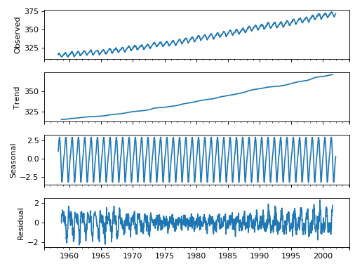
Some distinguishable patterns appear when we plot the data. The time-series has an obvious seasonality pattern, as well as an overall increasing trend. We can also visualize our data using a method called time-series decomposition. As its name suggests, time series decomposition allows us to decompose our time series into three distinct components: trend, seasonality, and noise.
Fortunately, statsmodels provides the convenient seasonal_decompose function to perform seasonal decomposition out of the box. If you are interested in learning more, the reference for its original implementation can be found in the following paper, "STL: A Seasonal-Trend Decomposition Procedure Based on Loess."
The script below shows how to perform time-series seasonal decomposition in Python. By default, seasonal_decompose returns a figure of relatively small size, so the first two lines of this code chunk ensure that the output figure is large enough for us to visualize.
from pylab import rcParams
rcParams['figure.figsize'] = 11, 9

decomposition = sm.tsa.seasonal_decompose(y, model='additive')
fig = decomposition.plot()
plt.show()

(SEASONAL) ARIMA MODEL
There are three distinct integers (p, d, q) that are used to parametrize ARIMA models. Because of that, ARIMA models are denoted with the notation ARIMA(p, d, q). Together these three parameters account for seasonality, trend, and noise in datasets:
- p is the auto-regressive part of the model. It allows us to incorporate the effect of past values into our model. Intuitively, this would be similar to stating that it is likely to be warm tomorrow if it has been warm the past 3 days.
- d is the integrated part of the model. This includes terms in the model that incorporate the amount of differencing (i.e. the number of past time points to subtract from the current value) to apply to the time series. Intuitively, this would be similar to stating that it is likely to be same temperature tomorrow if the difference in temperature in the last three days has been very small.
- q is the moving average part of the model. This allows us to set the error of our model as a linear combination of the error values observed at previous time points in the past.
When dealing with seasonal effects, we make use of the seasonal ARIMA, which is denoted as ARIMA(p,d,q)(P,D,Q)s. Here, (p, d, q) are the non-seasonal parameters described above, while (P, D, Q) follow the same definition but are applied to the seasonal component of the time series. The term s is the periodicity of the time series (4 for quarterly periods, 12 for yearly periods, etc.).
When looking to fit time series data with a seasonal ARIMA model, our first goal is to find the values of ARIMA(p,d,q)(P,D,Q)s that optimize a metric of interest. There are many guidelines and best practices to achieve this goal, yet the correct parametrization of ARIMA models can be a painstaking manual process that requires domain expertise and time. Other statistical programming languages such as R provide automated ways to solve this issue, but those have yet to be ported over to Python. In this section, we will resolve this issue by writing Python code to programmatically select the optimal parameter values for our ARIMA(p,d,q)(P,D,Q)s time series model.
We will use a "grid search" to iteratively explore different combinations of parameters. For each combination of parameters, we fit a new seasonal ARIMA model with the SARIMAX() function from the statsmodels module and assess its overall quality. Once we have explored the entire landscape of parameters, our optimal set of parameters will be the one that yields the best performance for our criteria of interest. Let's begin by generating the various combination of parameters that we wish to assess:
Parameter Selection for the ARIMA Time Series Model
# Define the p, d and q parameters to take any value between 0 and 2
p = d = q = range(0, 2)

# Generate all different combinations of p, q and q triplets
pdq = list(itertools.product(p, d, q))

# Generate all different combinations of seasonal p, q and q triplets
seasonal_pdq = [(x[0], x[1], x[2], 12) for x in list(itertools.product(p, d, q))]

print('Examples of parameter combinations for Seasonal ARIMA...')
print('SARIMAX: {} x {}'.format(pdq[1], seasonal_pdq[1]))
print('SARIMAX: {} x {}'.format(pdq[1], seasonal_pdq[2]))
print('SARIMAX: {} x {}'.format(pdq[2], seasonal_pdq[3]))
print('SARIMAX: {} x {}'.format(pdq[2], seasonal_pdq[4]))
We can now use the triplets of parameters defined above to automate the process of training and evaluating ARIMA models on different combinations. In Statistics and Machine Learning, this process is known as grid search (or hyperparameter optimization) for model selection.
When evaluating and comparing statistical models fitted with different parameters, each can be ranked against one another based on how well it fits the data or its ability to accurately predict future data points. We will use the AIC (Akaike Information Criterion) value, which is conveniently returned with ARIMA models fitted using statsmodels. The AIC measures how well a model fits the data while taking into account the overall complexity of the model. A model that fits the data very well while using lots of features will be assigned a larger AIC score than a model that uses fewer features to achieve the same goodness-of-fit. Therefore, we are interested in finding the model that yields the lowest AIC value.
The code chunk below iterates through combinations of parameters and uses the SARIMAX function from statsmodels to fit the corresponding Seasonal ARIMA model. Here, the order argument specifies the (p, d, q) parameters, while the seasonal_order argument specifies the (P, D, Q, S) seasonal component of the Seasonal ARIMA model. After fitting each SARIMAX() model, the code prints out its respective AIC score.
warnings.filterwarnings("ignore") # specify to ignore warning messages

for param in pdq:
    for param_seasonal in seasonal_pdq:
        try:
            mod = sm.tsa.statespace.SARIMAX(y,
                                            order=param,
                                            seasonal_order=param_seasonal,
                                            enforce_stationarity=False,
                                            enforce_invertibility=False)

            results = mod.fit()

            print('ARIMA{}x{}12 - AIC:{}'.format(param, param_seasonal, results.aic))
        except:
            continue
The output of our code suggests that SARIMAX(1, 1, 1)x(1, 1, 1, 12) yields the lowest AIC value of 277.78. We should therefore consider this to be optimal option out of all the models we have considered.
Fitting an ARIMA Time Series Model
#We'll start by plugging the optimal parameter values into a new SARIMAX model:
mod = sm.tsa.statespace.SARIMAX(y,
                                order=(1, 1, 1),
                                seasonal_order=(1, 1, 1, 12),
                                enforce_stationarity=False,
                                enforce_invertibility=False)

results = mod.fit()

print(results.summary().tables[1])
The summary attribute that results from the output of SARIMAX returns a significant amount of information, but we'll focus our attention on the table of coefficients. The coef column shows the weight (i.e. importance) of each feature and how each one impacts the time series. The P>|z| column informs us of the significance of each feature weight. Here, each weight has a p-value lower or close to 0.05, so it is reasonable to retain all of them in our model.
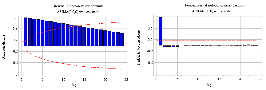
When fitting seasonal ARIMA models (and any other models for that matter), it is important to run model diagnostics to ensure that none of the assumptions made by the model have been violated. The plot_diagnostics object allows us to quickly generate model diagnostics and investigate for any unusual behavior.
results.plot_diagnostics(figsize=(15, 12))
plt.show()

Our primary concern is to ensure that the residuals of our model are uncorrelated and normally distributed with zero-mean. If the seasonal ARIMA model does not satisfy these properties, it is a good indication that it can be further improved.
In this case, our model diagnostics suggests that the model residuals are normally distributed based on the following:
- In the top right plot, we see that the red KDE line follows closely with the N(0,1) line (where N(0,1)) is the standard notation for a normal distribution with mean 0 and standard deviation of 1). This is a good indication that the residuals are normally distributed.
- The qq-plot on the bottom left shows that the ordered distribution of residuals (blue dots) follows the linear trend of the samples taken from a standard normal distribution with N(0, 1). Again, this is a strong indication that the residuals are normally distributed.
- The residuals over time (top left plot) don't display any obvious seasonality and appear to be white noise. This is confirmed by the autocorrelation (i.e. correlogram) plot on the bottom right, which shows that the time series residuals have low correlation with lagged versions of itself.
Those observations lead us to conclude that our model produces a satisfactory fit that could help us understand our time series data and forecast future values.
Although we have a satisfactory fit, some parameters of our seasonal ARIMA model could be changed to improve our model fit. For example, our grid search only considered a restricted set of parameter combinations, so we may find better models if we widened the grid search.
Validating Forecasts
We have obtained a model for our time series that can now be used to produce forecasts. We start by comparing predicted values to real values of the time series, which will help us understand the accuracy of our forecasts. The get_prediction() and conf_int() attributes allow us to obtain the values and associated confidence intervals for forecasts of the time series.
pred = results.get_prediction(start=pd.to_datetime('1998-01-01'), dynamic=False)
pred_ci = pred.conf_int()
The code above requires the forecasts to start at January 1998.
The dynamic=False argument ensures that we produce one-step ahead forecasts, meaning that forecasts at each point are generated using the full history up to that point.
We can plot the real and forecasted values of the CO2 time series to assess how well we did. Notice how we zoomed in on the end of the time series by slicing the date index.
ax = y['1990':].plot(label='observed')
pred.predicted_mean.plot(ax=ax, label='One-step ahead Forecast', alpha=.7)

ax.fill_between(pred_ci.index,
                pred_ci.iloc[:, 0],
                pred_ci.iloc[:, 1], color='k', alpha=.2)

ax.set_xlabel('Date')
ax.set_ylabel('CO2 Levels')
plt.legend()

plt.show()

Overall, our forecasts align with the true values very well, showing an overall increase trend.
It is also useful to quantify the accuracy of our forecasts. We will use the MSE (Mean Squared Error), which summarizes the average error of our forecasts. For each predicted value, we compute its distance to the true value and square the result. The results need to be squared so that positive/negative differences do not cancel each other out when we compute the overall mean.
y_forecasted = pred.predicted_mean
y_truth = y['1998-01-01':]

# Compute the mean square error
mse = ((y_forecasted - y_truth) ** 2).mean()
print('The Mean Squared Error of our forecasts is {}'.format(round(mse, 2)))
The MSE of our one-step ahead forecasts yields a value of 0.07, which is very low as it is close to 0. An MSE of 0 would that the estimator is predicting observations of the parameter with perfect accuracy, which would be an ideal scenario but it not typically possible.
However, a better representation of our true predictive power can be obtained using dynamic forecasts. In this case, we only use information from the time series up to a certain point, and after that, forecasts are generated using values from previous forecasted time points.
In the code chunk below, we specify to start computing the dynamic forecasts and confidence intervals from January 1998 onwards.
pred_dynamic = results.get_prediction(start=pd.to_datetime('1998-01-01'), dynamic=True, full_results=True)
pred_dynamic_ci = pred_dynamic.conf_int()
Plotting the observed and forecasted values of the time series, we see that the overall forecasts are accurate even when using dynamic forecasts. All forecasted values (red line) match pretty closely to the ground truth (blue line), and are well within the confidence intervals of our forecast.
ax = y['1990':].plot(label='observed', figsize=(15, 10))
pred_dynamic.predicted_mean.plot(label='Dynamic Forecast', ax=ax)

ax.fill_between(pred_dynamic_ci.index,
                pred_dynamic_ci.iloc[:, 0],
                pred_dynamic_ci.iloc[:, 1], color='k', alpha=.25)

ax.fill_betweenx(ax.get_ylim(), pd.to_datetime('1998-01-01'), y.index[-1],
                 alpha=.1, zorder=-1)

ax.set_xlabel('Date')
ax.set_ylabel('CO2 Levels')

plt.legend()
plt.show()

#Once again, we quantify the predictive performance of our forecasts by computing the MSE:
# Extract the predicted and true values of our time series
y_forecasted = pred_dynamic.predicted_mean
y_truth = y['1998-01-01':]

# Compute the mean square error
mse = ((y_forecasted - y_truth) ** 2).mean()
print('The Mean Squared Error of our forecasts is {}'.format(round(mse, 2)))
The predicted values obtained from the dynamic forecasts yield an MSE of 1.01. This is slightly higher than the one-step ahead, which is to be expected given that we are relying on less historical data from the time series.
Both the one-step ahead and dynamic forecasts confirm that this time series model is valid. However, much of the interest around time series forecasting is the ability to forecast future values way ahead in time.
Producing and Visualizing Forecasts
In the final step of this tutorial, we describe how to leverage our seasonal ARIMA time series model to forecast future values. The get_forecast() attribute of our time series object can compute forecasted values for a specified number of steps ahead.
# Get forecast 500 steps ahead in future
pred_uc = results.get_forecast(steps=500)

# Get confidence intervals of forecasts
pred_ci = pred_uc.conf_int()
#We can use the output of this code to plot the time series and forecasts of its future values.

ax = y.plot(label='observed', figsize=(15, 10))
pred_uc.predicted_mean.plot(ax=ax, label='Forecast')
ax.fill_between(pred_ci.index,
                pred_ci.iloc[:, 0],
                pred_ci.iloc[:, 1], color='k', alpha=.25)
ax.set_xlabel('Date')
ax.set_ylabel('CO2 Levels')

plt.legend()
plt.show()

Both the forecasts and associated confidence interval that we have generated can now be used to further understand the time series and foresee what to expect. Our forecasts show that the time series is expected to continue increasing at a steady pace.
As we forecast further out into the future, it is natural for us to become less confident in our values. This is reflected by the confidence intervals generated by our model, which grow larger as we move further out into the future.
Conclusion
In this tutorial, we described how to implement a seasonal ARIMA model in Python. We made extensive use of the pandas and statsmodels libraries and showed how to run model diagnostics, as well as how to produce forecasts of the CO2 time series.
Here are a few other things you could try:
- Change the start date of your dynamic forecasts to see how this affects the overall quality of your forecasts.
- Try more combinations of parameters to see if you can improve the goodness-of-fit of your model.
- Select a different metric to select the best model. For example, we used the AIC measure to find the best model, but you could seek to optimize the out-of-sample mean square error instead.
For more practice, you could also try to load another time series dataset to produce your own forecasts (like the sunspots, see data hereafter)
dataSunSpot = sm.datasets.sunspots.load_pandas().data